This tutorial will explain Liferay Portal’s themes feature in detail. It will also discuss how to use Themes in conjunction with other features to easily build your website within Liferay Portal.
Themes make it possible to easily switch to different presentations or "look and feel" layers. Within a single .war file, a designer/developer can deliver an integrated package of JSP (or Velocity), Javascript, image, and configuration files that will control all presentation logic and design attributes for a portal community. Liferay Portal comes with a handful of pre-made themes that showcase its versatility:

Different themes can be assigned to specific user groups (a.k.a. communities)
Users can choose a unique theme for their own personal portal page
Both Java Server Page (JSP) and Velocity (VM) languages are supported
Themes are hot-deployable as .wars (when supported by the app server)
To select a different theme, go to the Look and Feel section in the header bar and choose one of the available themes and a corresponding color scheme. The process is as straightforward as setting a new desktop background in Windows.
Making a new theme requires only four main steps:
Configure properties
Edit templates (JSP or VM)
Define CSS styles
Code JavaScript (optional)
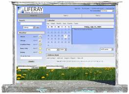
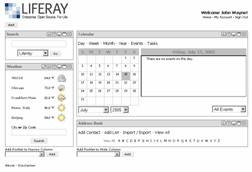
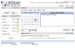
Let’s take a high-level look at how Liferay created the JSP-based "Brochure" theme (Figure 2.6) by modifying a few things in a copy of the "Classic" theme (Figure 2.1).
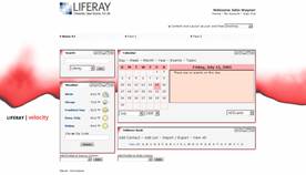
Note: If you want to see an example using VM, take a look at the bundled "Velocity" theme (Figure 2.3).
First, we created a copy of the "Classic" theme’s directory and renamed it "brochure." (Figure 2.1.1.1). We then deleted the color-schemes directory because we decided we would only have one color scheme for the "Brochure" theme. Although you do not have to follow the layout shown here, this convention will make your themes easier to organize and keep them standard.
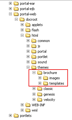
Figure 2.1.1.1 Directory structure
Once a directory is created to house your new theme, you need to let Liferay know the new theme’s directory location. This is done in liferay-look-and-feel.xml (Figure 2.1.1.2). Notice that the theme configuration shows theme id="brochure" and identifies the compatible version. The root-path, templates-path and images-path are also set here. Make sure that these values match your directory structure.
<look-and-feel>
<compatibility>
<version>3.6.1</version>
</compatibility>
<theme id="brochure" name="Brochure">
<root-path>/html/themes/brochure</root-path>
<templates-path>/html/themes/brochure/templates</templates-path>
<images-path>/html/themes/brochure/images</images-path>
<template-extension>jsp</template-extension>
<color-scheme id="01" name="Default">
<!-- color-scheme content omitted to simplify example -->
</color-scheme>
</theme>
</look-and-feel>
Figure 2.1.1.2 Liferay-look-and-feel.xml
Now that Liferay Portal is configured to load your theme, the next step is to edit the template files that give the theme its uniqueness. Here is a brief description of some of the templates that are used in the default theme.
| init.jsp | Initializes variables and properties needed for the theme. |
| css.jsp | Contains CSS style definitions for your entire theme. |
| portal_normal.jsp | Controls the layout of portal templates for normal pages. |
| portal_pop_up.jsp | Controls the layout of portal templates for pop-ups. |
| top.jsp | Draws the top of the portal. |
| bottom.jsp | Draws the bottom of the portal. |
| navigation.jsp | Draws the navigation bar of the portal. |
| portlet_top.jsp | Draws the top of each portlet. |
| Draws the top of each portlet. | Draws the bottom of each portlet. |
| javascript.jsp | Contains JavaScript declarations. |
Each template controls the layout of a particular area within the portal. For instance, portlet_top.jsp controls the top portion of each portlet; navigation.jsp determines how the navigation bar will look.
Keep in mind that not all of these templates require modification nor are you limited to the ones mentioned here. Feel free to add another template to control a different area of the portal. Just make sure to include the template in portal_normal.jsp and/or portal_pop_up.jsp.
A number of changes were made to these templates for the brochure theme. In the figures below, you can see one such major change made to the placement and appearance of the portal configuration menu (Figures 2.1.2.1 and 2.1.2.2):
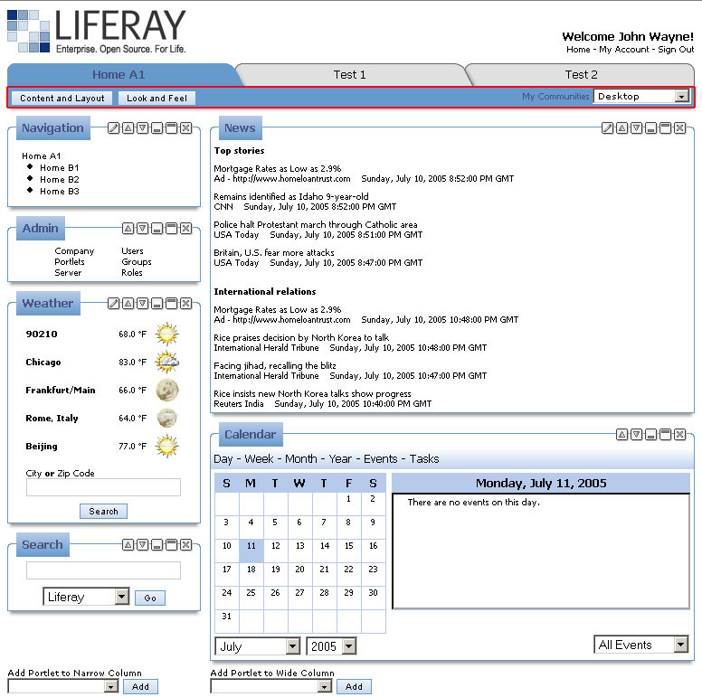
Figure 2.1.2.1 The "Classic" theme's portal config menu is integrated with the tabs.
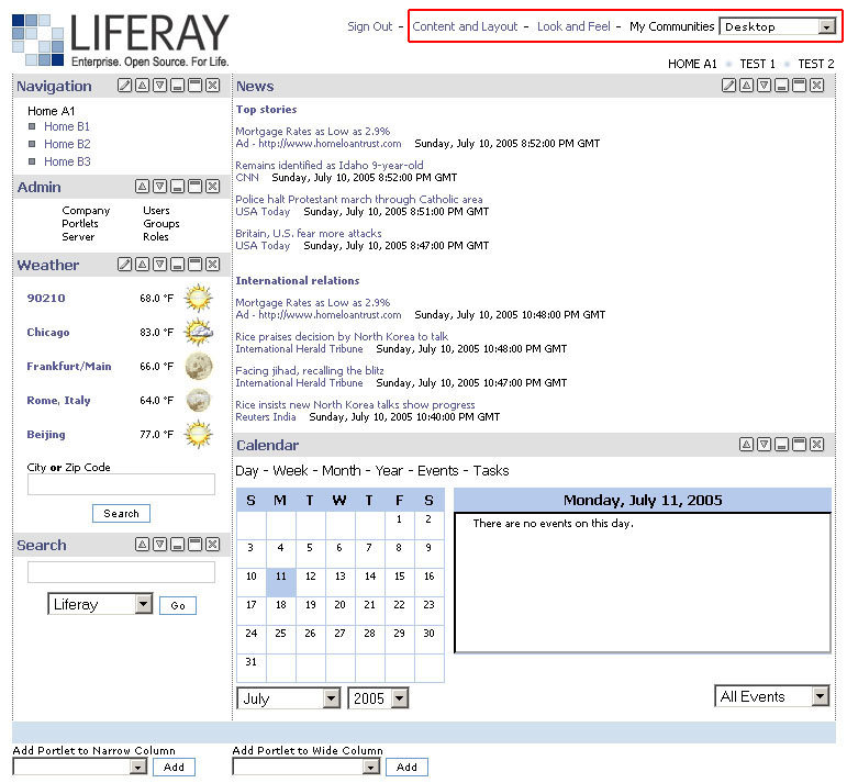
Figure 2.1.2.2 The "Brochure" theme's portal config menu is relocated to the top of the portal.
In the "Classic" theme, the portal configuration menu is part of the navigation bar. It consists of buttons and a dropdown menu. In contrast, the "Brochure" theme has the portal configuration menu relocated to the top of the portal and separated from the navigation bar. Also notice that the buttons are now simple text links. Some of the required code changes are displayed below in Figure 2.1.2.3:
<div id="layout-outer-side-decoration">
<div id="layout-inner-side-decoration">
<div id="layout-top-decoration">
<div id="layout-corner-ul"></div>
<div id="layout-corner-ur"></div>
</div>
<div id="layout-box">
<div id="layout-top">
<div id="layout-logo">
<a class="bg" href="<%= themeDisplay.getPathFriendlyURL() %>/guest/home"><img border="0" hspace="0" src="<%= themeDisplay.getCompanyLogo() %>" vspace="0"></a>
</div>

<c:if test="<%= themeDisplay.isSignedIn() %>">
<div id="layout-user-menu">
<a style="font-size: 8pt;" href="<%= themeDisplay.getURLSignOut() %>"><bean:message key="sign-out" /></a> -

<c:if test="<%= GetterUtil.getBoolean(PropsUtil.get(PropsUtil.UNIVERSAL_PERSONALIZATION)) || RoleLocalServiceUtil.isPowerUser(user.getUserId()) %>">
<a style="font-size: 8pt" href="<%= themeDisplay.getPathMain() %>/portal/personalize_forward?group_id=<%= portletGroupId %>"><%= LanguageUtil.get(pageContext, "content-and-layout") %></a> -
</c:if>

<c:if test="<%= GetterUtil.getBoolean(PropsUtil.get(PropsUtil.LOOK_AND_FEEL_MODIFIABLE)) %>">
<a style="font-size: 8pt" href="<%= themeDisplay.getPathMain() %>/portal/look_and_feel_forward?group_id=<%= portletGroupId %>"><%= LanguageUtil.get(pageContext, "look-and-feel") %></a> -
</c:if>

<font class="portlet-font" style="font-size: 8pt;">
<%= LanguageUtil.get(pageContext, "my-communities") %>
</font>

<% String selectedStyle = "style=\"background: " + colorScheme.getPortletMenuBg() + "; color: " + colorScheme.getPortletMenuText() + ";\" "; %>

<font size="2">
<select name="my_communities_sel" style="font-family: Verdana, Arial; font-size: smaller; font-weight: normal;" onChange="self.location = '<%= themeDisplay.getPathMain() %>/portal/group_forward?group_id=' + this.value;">
<option <%= !layout.isGroup() ? selectedStyle : "" %> value="<%= Group.DEFAULT_PARENT_GROUP_ID %>"><%= LanguageUtil.get(pageContext, "desktop") %></option>

<% List myCommunities = UserLocalServiceUtil.getGroups(user.getUserId());
for (int i = 0; i < myCommunities.size(); i++) {
Group myCommunity = (Group)myCommunities.get(i);
%>
<option <%= layout.isGroup() && layout.getGroupId().equals(myCommunity.getGroupId()) ? selectedStyle + "selected" : "" %> value="<%= myCommunity.getGroupId() %>"><%= myCommunity.getName() %></option>

<% } %>

</select>
</font>
</div>
</c:if>
Figure 2.1.2.3 top.jsp for the "Brochure" theme
Another major part of every theme is the collection of presentation attributes such as font size, background color, padding, and margin. The best way to control these attributes in your theme is to use cascading style sheets (CSS). As mentioned briefly above, css.jsp contains all the CSS style definitions for your theme. Liferay Portal’s default themes include all JSR-168 standard style definitions. You may also add theme-specific style definitions to css.jsp. Using the templates and adding custom images as necessary, you can use standard and custom style definitions to give your theme a distinctive look and feel. Let’s look at some of the style changes made in the "Brochure" theme.
Header Bar
.portlet-header-bar {
    background-color: #e0e0e0;
    margin: 0 1px 0 1px;
    padding: 3px 0px 3px 0px;
    position: relative;
    z-index: 2;
    }


    <%@ include file="init.jsp" %>

    <div class="portlet-container" style="width: <%= portletDisplay.getWidth() %>">
    <div class="portlet-header-bar">
    <c:if test="<%= Validator.isNotNull(portletDisplay.getTitle()) %>">
    <div class="portlet-title">
    <b> <%= portletDisplay.getTitle() %> </b>
    </div>
    </c:if>
The style definition portlet-header-bar is used in the portlet_top template. The portlet_top template is used to draw the top of each portlet within the portal. As you can see from the portlet-header-bar definition, the header bar for each portlet should have a gray background color, with a small margin on its sides, padding on top and bottom, positioned relatively and with a z-index of 2.
Dynamic Style Values
Style values can be retrieved dynamically from color scheme variables defined in liferay-look-and-feel.xml. Because the style sheet is a JSP file, you can use JSP tags to dynamically assign some of your style definition values. For example:
.portlet-title {
    color: <%= colorScheme.getPortletTitleText() %>
    font-family: Tahoma, Arial;
    font-size: smaller;
    vertical-align: middle;
    }
In the above code, portlet-title’s color attribute has its value retrieved dynamically. This way, depending on the color scheme selected on the "Look and Feel" page in the portal, the title bar will have a color appropriate to the currently selected color scheme.
Please refer to the theme user guide for more information.
JavaScript
You can use JavaScript to create a more dynamic interface for your theme. To use a script, put the script file inside your theme directory, then provide the location of this file in the script declaration in javascript.jsp. For example, if your JavaScript file is called my_script.js and it is located in html/themes/my_themes/js, make the following declaration in javascript.jsp:
<script language="JavaScript" src="<%= themeDisplay.getPathThemeRoot() %>/js/my_script.js"></script>
The JSP expression <%= themeDisplay.getPathThemeRoot() %> helps keep you from hard-coding information in your templates. Refer to the API to see other variables and methods available to you.
Both the "Clean" theme (Figure 2.5) and the "Genesis" theme (Figure 2.4) use JavaScript to create a dynamic interface.