| Tag Summary |
| alert | No Description |
| app-view-display-style | Deprecated as of 7.0.0, replaced by liferay-aui:nav-item. |
| app-view-entry | Creates a component for displaying entry items such as images, documents, folders, etc. in a concise but informative manner. Items are displayed in a similar fashion to entries in the file system of most operating systems. |
| app-view-search-entry | Creates a component for displaying search results of entries in app view. |
| app-view-toolbar | Creates a toolbar for viewing items in app view. |
| asset-add-button | No Description |
| asset-addon-entry-display | No Description |
| asset-addon-entry-selector | No Description |
| asset-categories-available | No Description |
| asset-categories-error | No Description |
| asset-categories-selector | No Description |
| asset-categories-summary | No Description |
| asset-display | No Description |
| asset-links | No Description |
| asset-metadata | No Description |
| asset-tags-available | No Description |
| asset-tags-error | Creates a liferay-ui:error component to display tag-related error messages. |
| asset-tags-navigation | No Description |
| asset-tags-selector | Creates a Liferay.AssetTagsSelector component to create and select tags to add to an asset, such as a blog entry, bookmark, or wiki page. |
| asset-tags-summary | Creates a component to display all the tags associated with an asset, such as a blog entry, wiki page, or message boards message. |
| breadcrumb | No Description |
| calendar | Creates a calendar with configurable events. |
| categorization-filter | No Description |
| diff-html | No Description |
| discussion | No Description |
| drop-here-info | No Description |
| empty-result-message | No Description |
| error | Creates an error message to display to the user. |
| error-header | Creates a liferay-ui:header with a back button; it's for displaying above an error message. |
| error-marker | No Description |
| error-principal | Creates an authorization failure error message to display to the user. |
| flash | No Description |
| form-navigator | Creates a navigable form for multiple section forms. Its default navigation is a side navigation box with links to each section. The navigation can be configured as a progressive step navigation positioned above the form, or as vertically stacked accordion style sections that expand when clicked. |
| group-search | No Description |
| header | Creates a header that displays its text above a horizontal rule accompanied by a configurable back URL button. |
| icon | Creates a fully configurable icon that provides access to current Liferay theme icons. |
| icon-deactivate | Creates an icon to associate with deactivating an item. |
| icon-delete | Creates a configurable icon to associate with deleting or removing an item. |
| icon-help | Creates a help icon that displays a custom message as a tooltip on mouse over of the help icon. |
| icon-list | Creates a list of icons from a list of child components. |
| icon-menu | Creates an icon menu from a list of child components. |
| input-asset-links | No Description |
| input-checkbox | Creates a configurable input checkbox. |
| input-date | Creates a date input field that displays a calendar for date selection. |
| input-editor | Creates an input field for editing rich text. |
| input-field | No Description |
| input-localized | No Description |
| input-move-boxes | Creates an input move boxes component comprised of two columns of key value pairs that can be rearranged. |
| input-permissions | No Description |
| input-permissions-params | No Description |
| input-repeat | Creates a component allowing users to make an event repeat over a given interval. |
| input-resource | Creates an input field for selecting resources such as folders. |
| input-scheduler | No Description |
| input-search | Creates a configurable search box. |
| input-select | Creates a select input component with yes or no options. |
| input-textarea | Creates a configurable text area input field. |
| input-time | Creates a time input field that provides a scrollable dropdown list of hours, in intervals designated by the minuteInterval attribute. |
| input-time-zone | Creates a configurable timezone drop-down menu. |
| journal-content-search | No Description |
| language | No Description |
| layout-common | No Description |
| layout-templates-list | No Description |
| logo-selector | No Description |
| membership-policy-error | No Description |
| menu | No Description |
| menu-item | No Description |
| message | Creates a message to display to the user. |
| my-sites | No Description |
| organization-search-container-results | No Description |
| organization-search-form | No Description |
| page-iterator | Creates a page iterator for paginating through lists of items. |
| panel | Creates a collapsible panel for housing content. |
| panel-container | Creates a collapsible container to house liferay-ui:panel components. |
| param | No Description |
| png-image | Renders a PNG image with the source given for the image attribute. |
| quick-access | No Description |
| quick-access-entry | No Description |
| ratings | No Description |
| ratings-score | No Description |
| restore-entry | No Description |
| rss | Creates a clickable link and/or icon to an RSS feed document. |
| rss-settings | Creates a configuration component for users to define RSS settings, such as how many articles to display. |
| search | Creates a search form, with an additional select input to set the scope of the search. |
| search-container | Creates a grid for displaying a list of objects and their properties. |
| search-container-column-button | No Description |
| search-container-column-date | Creates a date column in a search container. |
| search-container-column-icon | Creates a column in a search container for displaying an icon. |
| search-container-column-image | Creates a column in a search container for displaying an image. |
| search-container-column-jsp | Creates a column in a search container with the contents of a JSP file. |
| search-container-column-status | Creates a column in a search container for the workflow status. |
| search-container-column-text | Creates a text column in a search container. |
| search-container-column-user | No Description |
| search-container-results | The list of objects to display in the search container. |
| search-container-row | Creates rows in the search container for each object returned by liferay-ui:search-container-results. |
| search-container-row-parameter | Creates parameters for rows in the search container. The liferay-ui:search-container-row tag is required. |
| search-form | No Description |
| search-iterator | Creates a search results page iterator with an optional paginator. |
| search-paginator | Creates a page iterator to paginate through search results. |
| search-speed | No Description |
| search-toggle | Creates a search instance that can be toggled between basic and advanced search. |
| section | No Description |
| sites-directory | No Description |
| social-activities | No Description |
| social-bookmark | No Description |
| social-bookmarks | Creates icons and links to share content on social outlets such as Facebook and Twitter. |
| social-bookmarks-settings | No Description |
| success | Creates a success message to display to the user. |
| table-iterator | No Description |
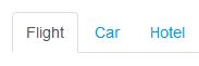
| tabs | Creates a tabbed UI of section dividers that each house their own content.
Example:
 . . |
| toggle | Creates a component that toggles the visibility of the content of the component matching the given id. Default icons are used as the component's default mechanism for showing and hiding the content. |
| toggle-area | Creates a component that toggles the visibility of a div and its contents. |
| toggle-value | No Description |
| toolbar-item | No Description |
| upload-progress | Creates a progress bar for items being uploaded. |
| user-display | No Description |
| user-group-search-container-results | No Description |
| user-name-fields | No Description |
| user-portrait | No Description |
| user-search | No Description |
| user-search-container-results | No Description |
| user-search-form | No Description |